Subsequent Purchase Induction Experiment
※ Before writing, I recommend you to watch the loss avoidance bias of mobile games first.
Background of the experiment
As a puzzle game developer, you probably know that continuity accounts for the majority of game goods consumption in almost any match genre puzzle game. This experiment is aimed at increasing the percentage of continuous purchases by users. As introduced in the mobile game’s loss avoidance bias, the key is to stimulate loss avoidance bias by recognizing various penalty information that users may lose if they do not continue.

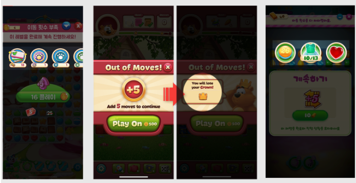
Top tier games of the store’s match genre, such as cookie jam, toon blast, and candy crush soda, are already using this method a lot. It recognizes a variety of information that users feel like they can lose or lose when they do not continue, such as heart information consumed when entering the level, the progress of the level mission, and the progress of the event mission. In the games mentioned above, these loss avoidance bias stimulus points are not only continuous, but can also be seen when attempting to leave the in-game [1]. Although this design is already used by many games, there are quite a few games that are not, and it is meaningful to verify how effective it is with indicators. In addition, when providing penalty information in a reference game, the UI flow phase (Deepth) is usually divided into two types: first stage (cookie jam, candy crush soda) or second stage (toon blast, etc.), and we verified which is more effective.
An experimental hypothesis
1. If penalty information that can stimulate the user’s loss avoidance bias is provided in the follow-up pop-up, the follow-up purchase rate will increase.
2. When providing penalty information as a two-stage UI flow, the purchase rate will increase by recognizing the information more clearly.
An experimental method
In Mahjong Live Project, a kind of match genre, we experimented in three sets (Master/A/B). As in other experiments, the level design and the supply of goods (coin and booster) were applied equally between each set as control variables. However, in this experiment, when providing penalty information as a kind of control variable, the indicators were tracked by dividing them into UI flows in step 1 and UI flows in step 2, respectively. In addition, when providing penalty information in two stages, we decided to check if there was a decrease in play time and retention. We tracked approximately 50,000 pop-up exposures and purchase logs per set over a week, with independent variables marking loss avoidance bias stimulus information (waste of hearts) and dependent variables as follow-up purchase rates.
1. Master set does not provide penalty information in the follow-up pop-up, and immediately leaves the in-game when the close button is touched.
2. Set A provides penalty information for hearts when touching the close button in the follow-up pop-up as a step 1 UI flow.
3. Set B provides penalty information for hearts when the close button is touched in the follow-up pop-up as a step 2 UI flow.
4. Follow up Track purchase ratio to pop-up exposure.

Draft of the following pop-up used in the experiment
The results of an experiment
* For security reasons, we do not disclose detailed experimental designs and data.

Powered by JSFiddle.net
The purchase rate of A and B sets, which stimulated the user’s bias to avoid losses by providing penalty information when touching the Close Follow button, was 6% and 19% higher than that of the Master, respectively. In addition, the purchase rate of Set B, which provided penalty information in the second stage UI flow, was 13% points higher than that of Set A. Therefore, all the hypotheses were adopted, and fortunately, the retention and playtime of the B set, which we were concerned about, were not reduced compared to other sets. As discussed in the selection experiment and mobile gaming main lobby, it seems a good strategy to minimize the information provided to users as much as possible to prevent information overload and to encourage them to focus on important information even if the UI flow level increases slightly. As continuing is a major consumer of game goods for puzzle game users, the results of this experiment will be useful for developers of various match genres. In particular, even if you can’t provide various mission-type operation events or winning events like reference games, I think it’s a good design that can be applied to small puzzle games by utilizing action skills such as hearts and mission achievement information by level.
Suggestion
The content of the subject game was not as abundant as the reference game, so the only penalty information provided was action, but if there is a chance, it would be good to conduct additional experiments to see if the purchase ratio can be higher when using the information on winning or achieving various mission events together.
[1] We also experimented to see if we could reduce the rate of in-game deviation when we presented loss avoidance bias stimulation information to users who wanted to leave the in-game. I’m going to write about it soon (I don’t know when it’s going to be because there.
*Original source: https://brunch.co.kr/@jaehyunkim